Library Love - Denver
A friend traveled to Denver recently and I encouraged her to visit the Central Library while there. She wasn’t sure about visiting as the Post-Modern style of architecture wasn’t her favorite. However, whether you like post-modern architecture or not, there is much to recommend about this favorite space of mine!
Michael Graves did a very thoughtful expansion to the 1950s modernist library designed by Burnham Hoyt. The original building was modest in size and character and the expansion increased it threefold. The addition was designed as a backdrop to the Hoyt design. Thus, the library was open for the city during construction with the expansion built first, and the existing library renovated later.
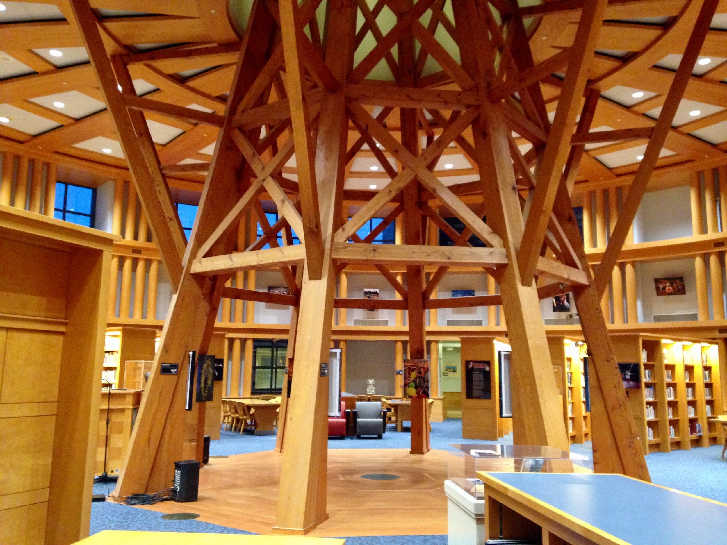
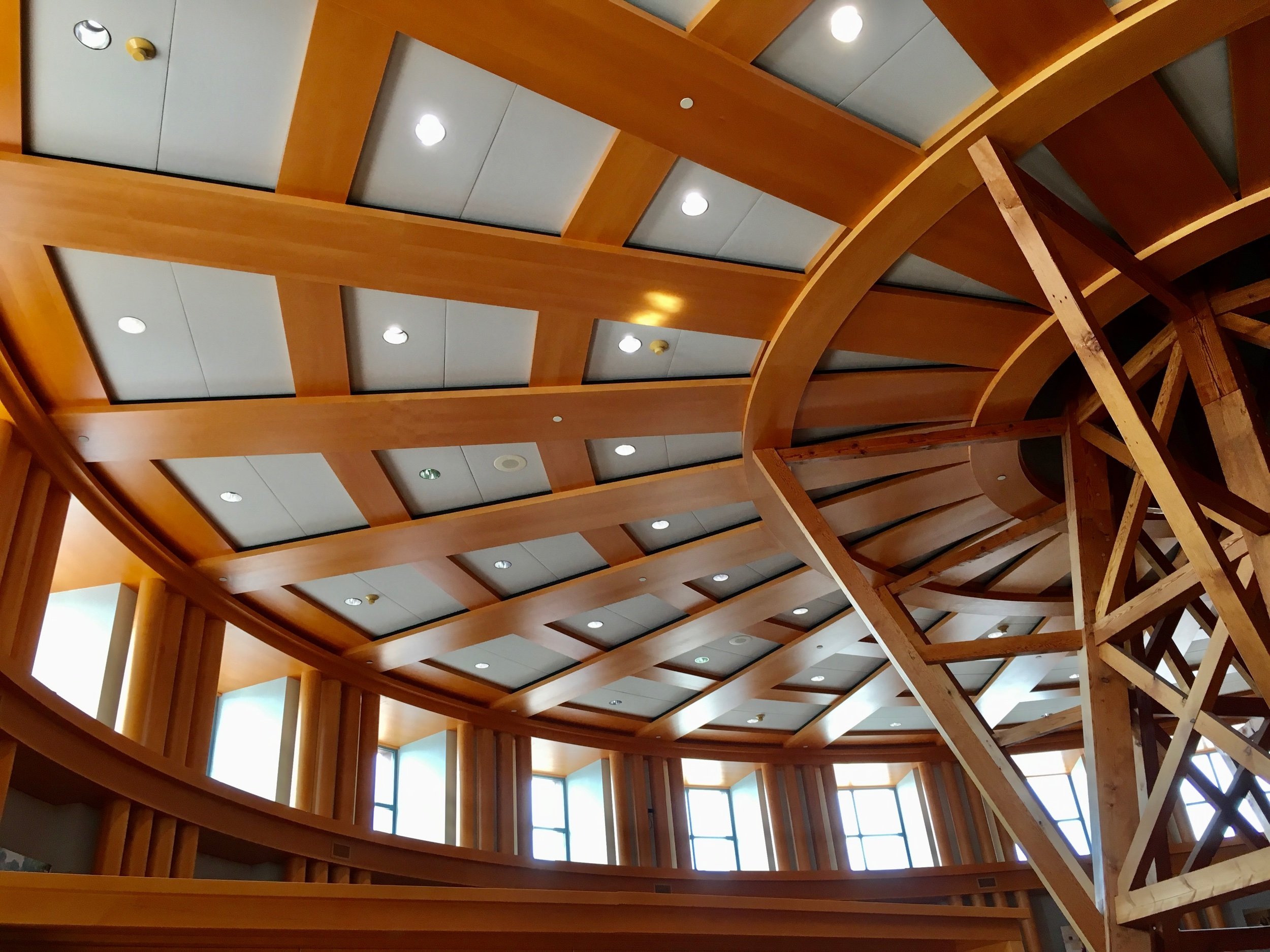
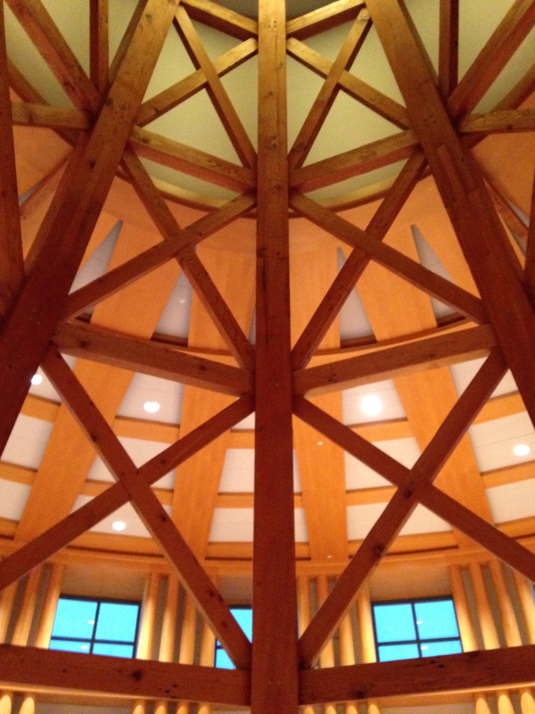
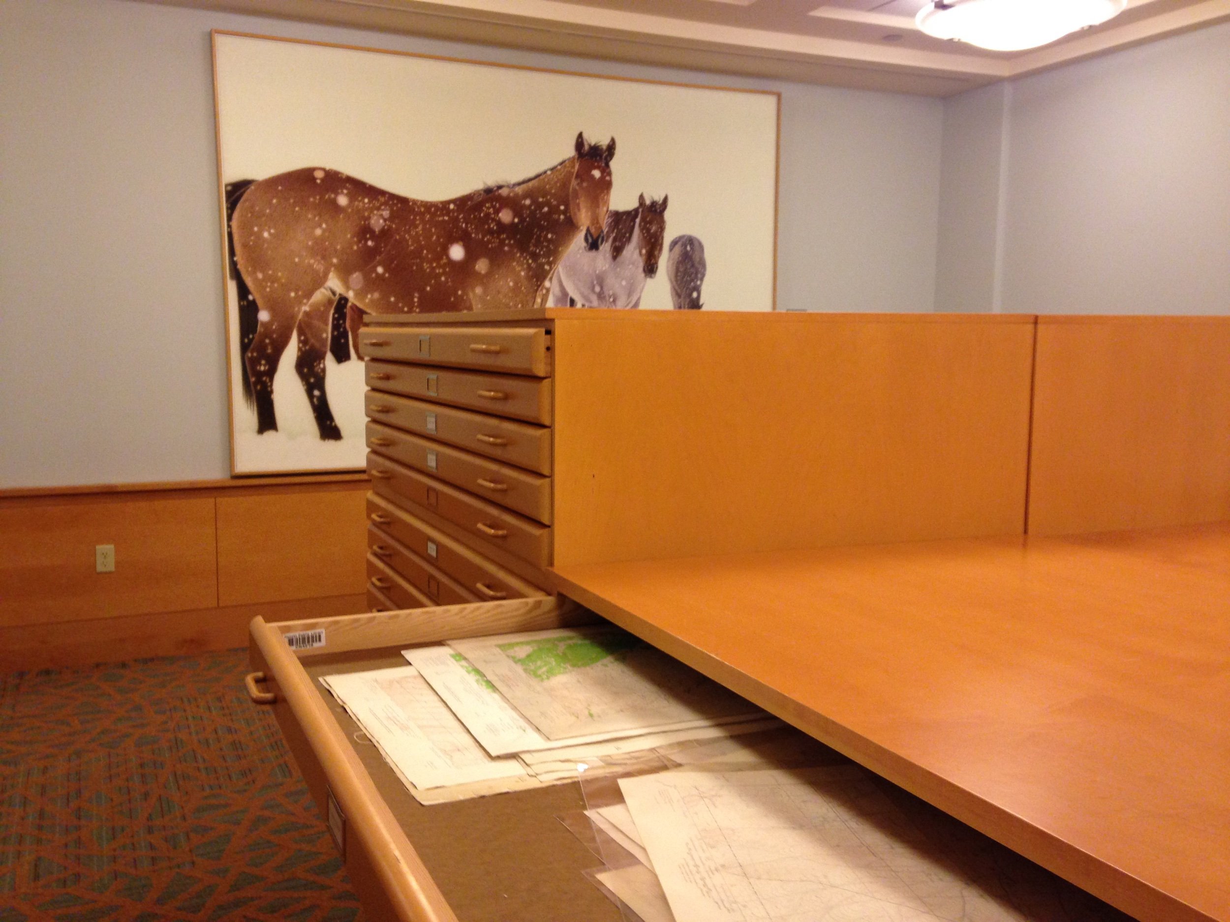
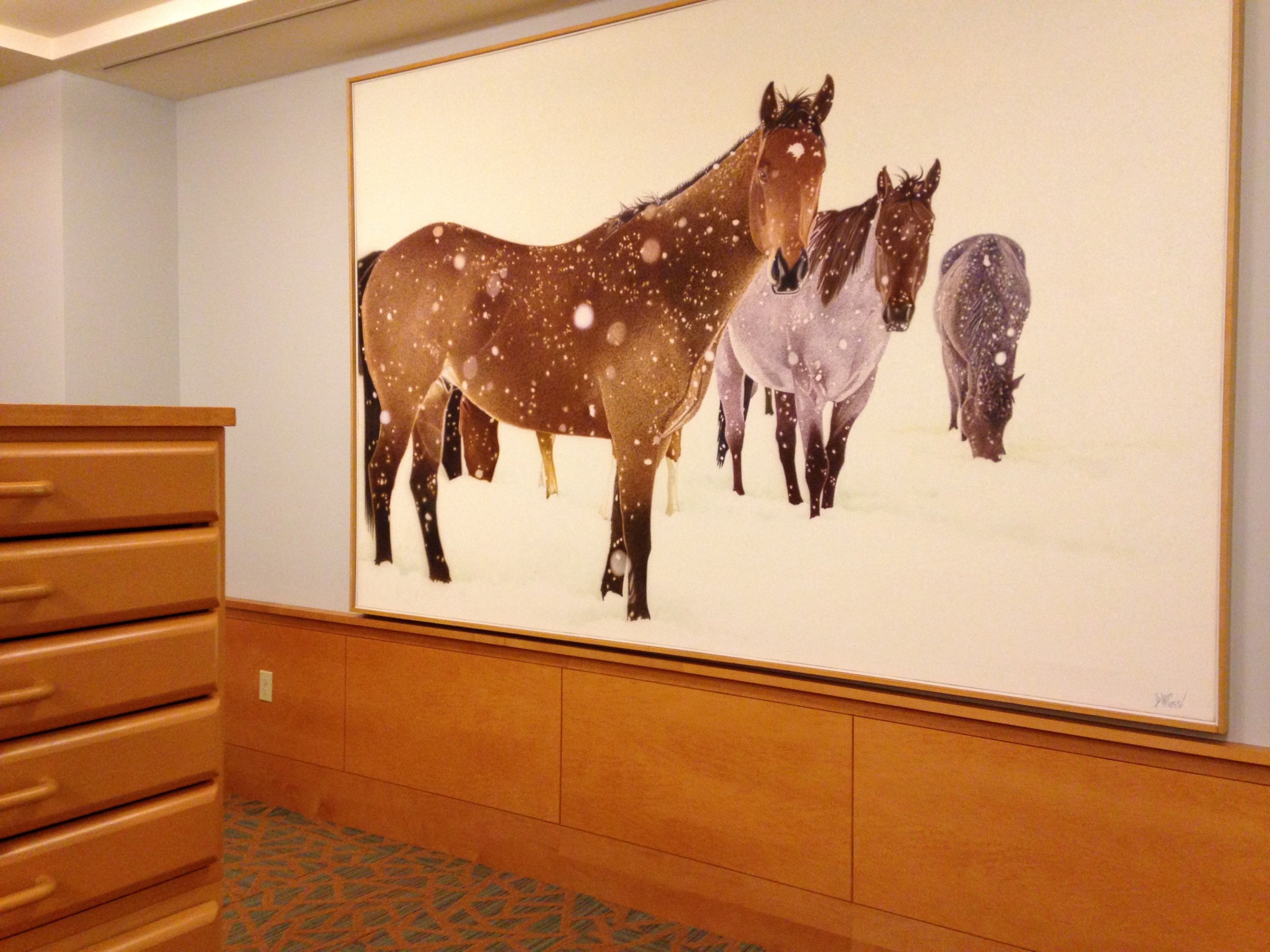
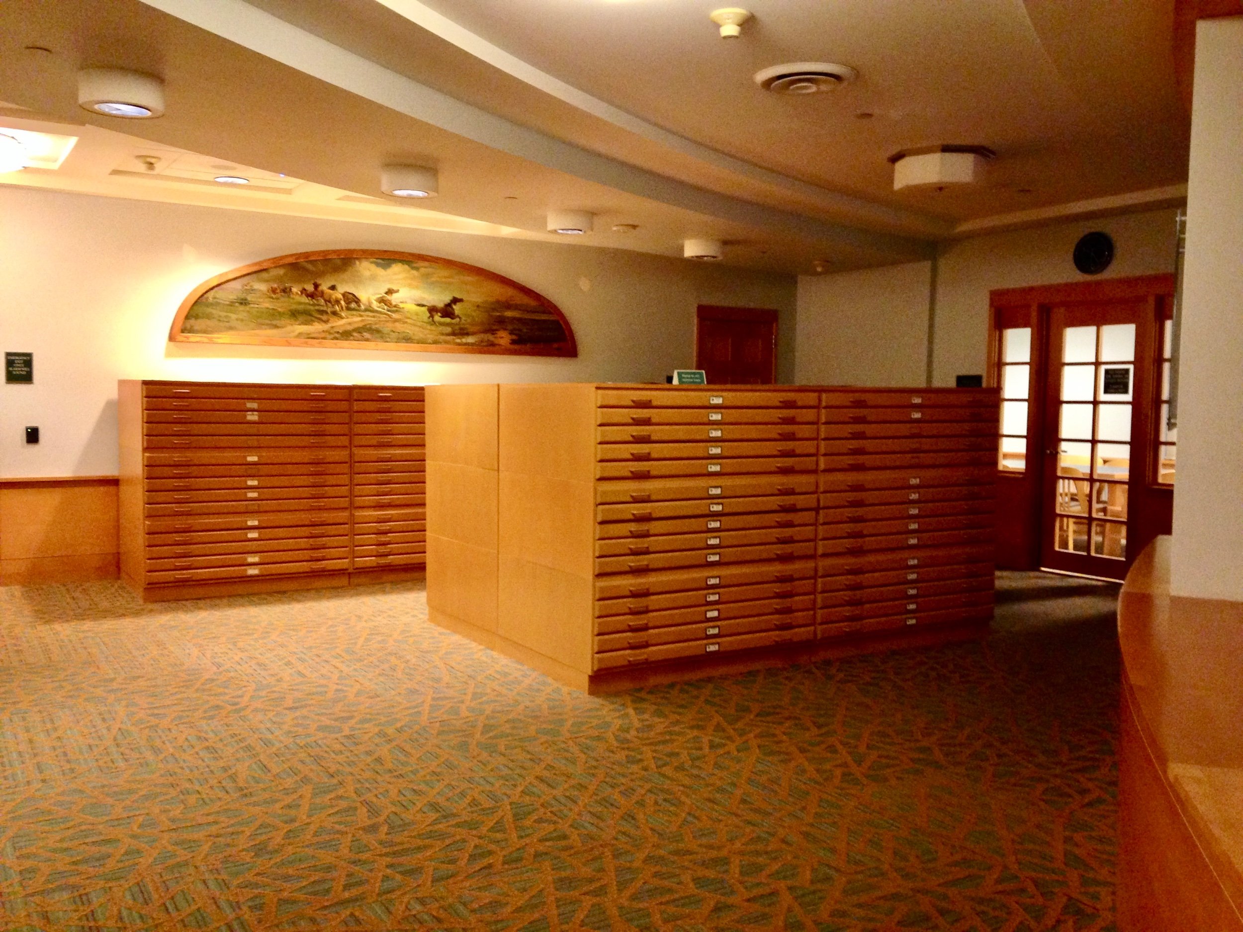
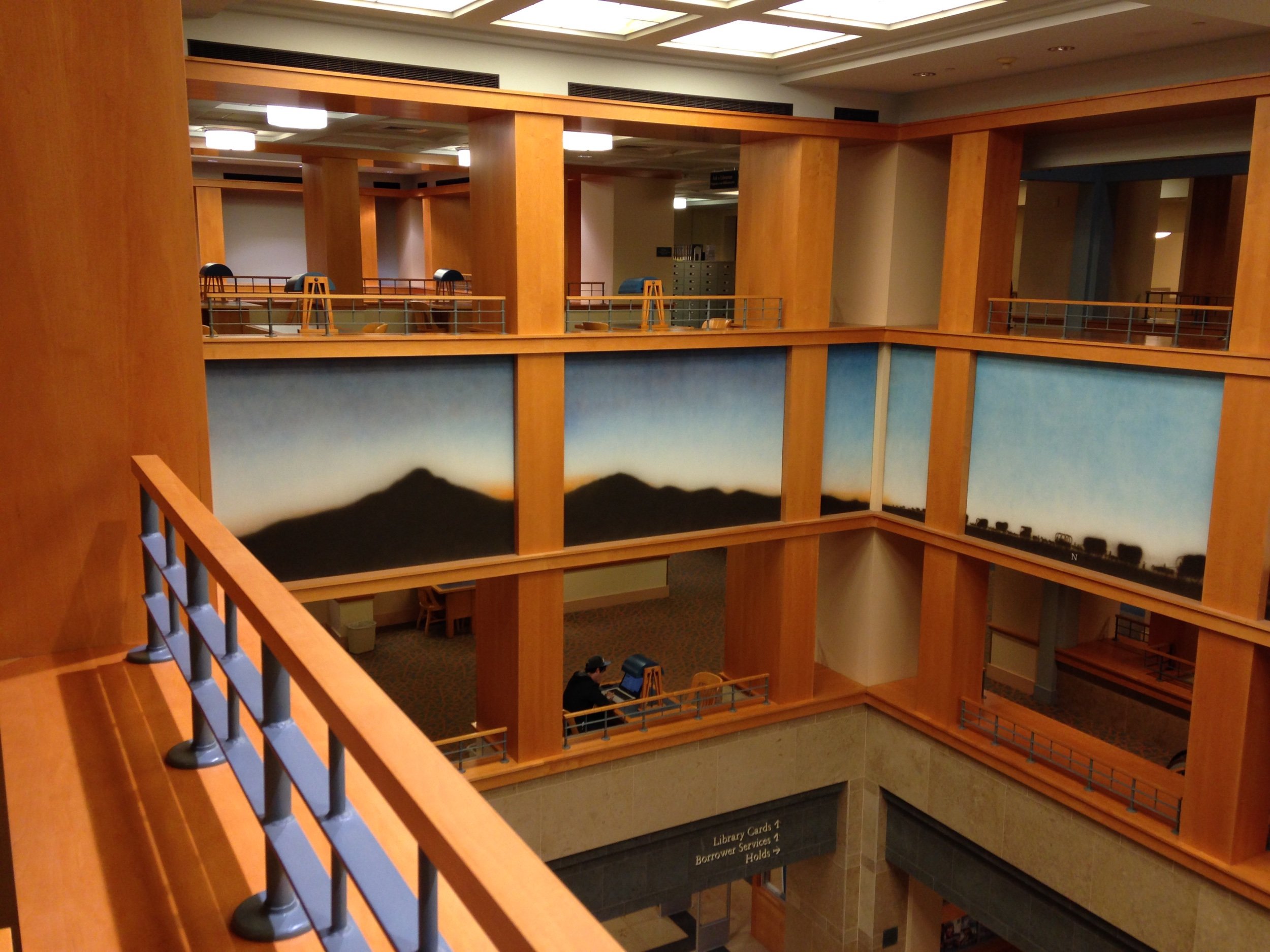
While I appreciate the playful, multi-colored exterior, the interior with it’s millwork (gallery below), public spaces, and views of the cityscape appeal even more.
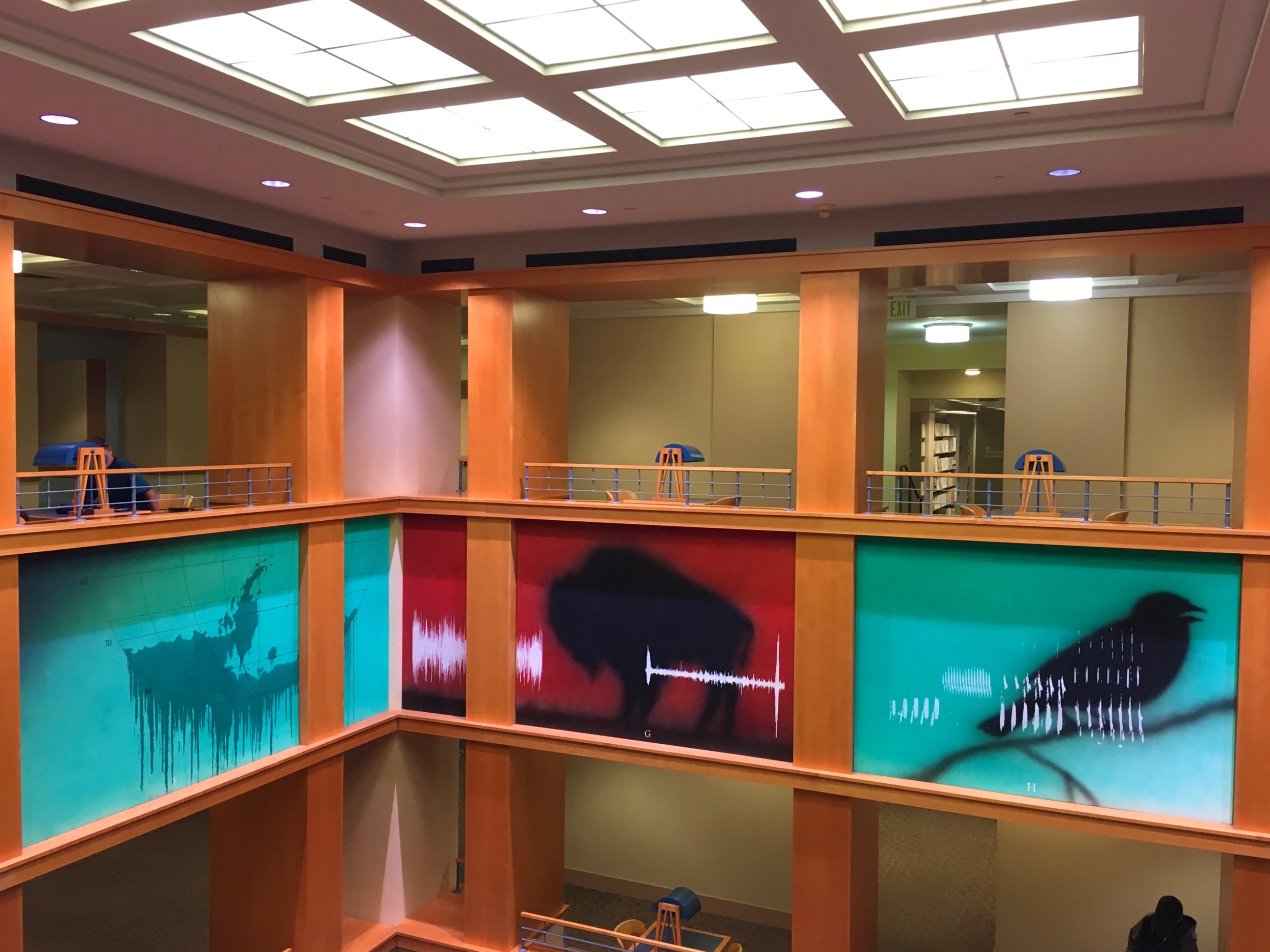
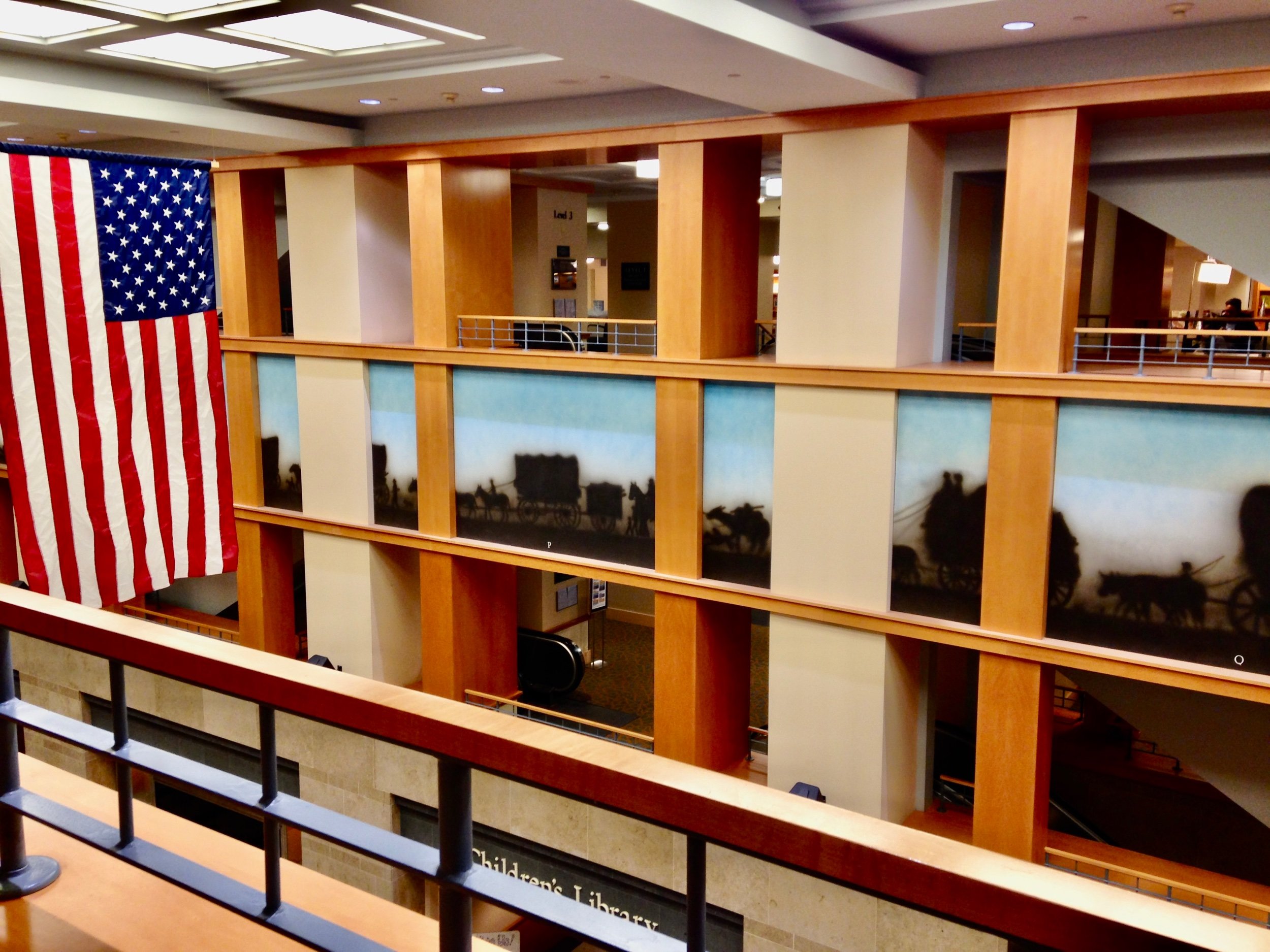
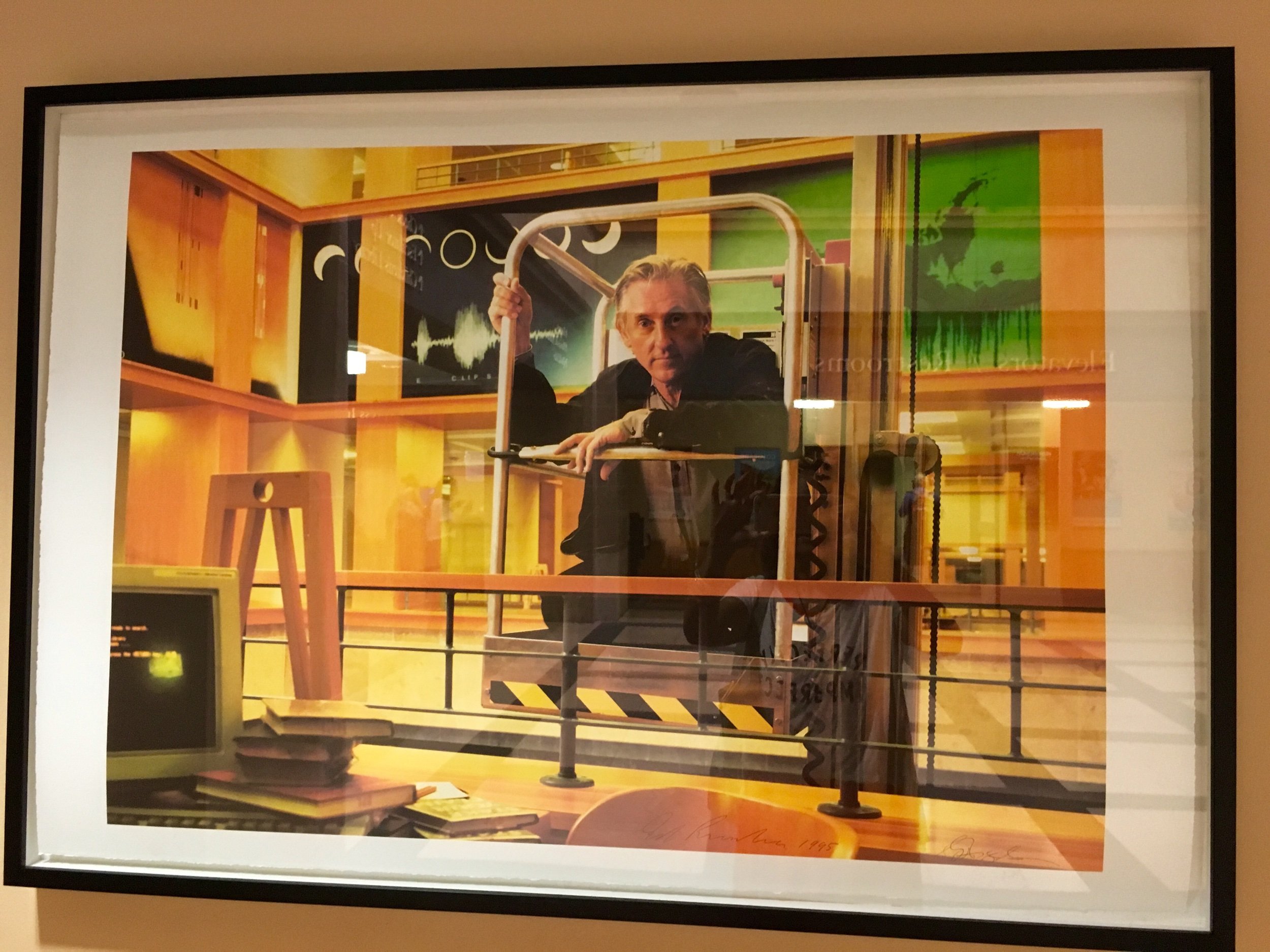
A highlight for me is the artwork by Ed Ruscha in the Great Hall. Along the upper gridded surfaces lie a 70-panel mural depicting a “rolling historical landscape” of Colorado and the West.
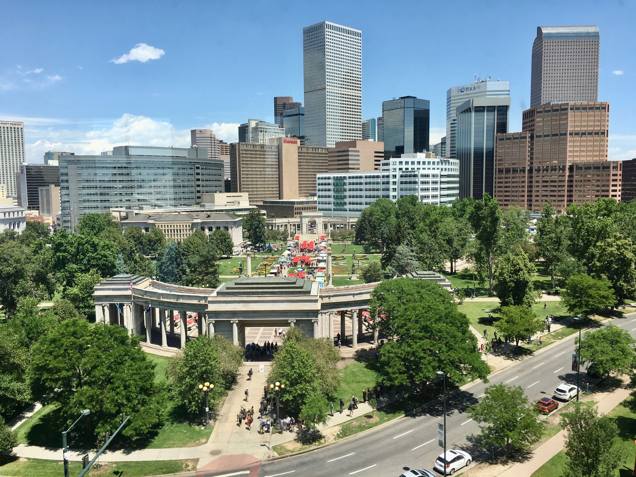
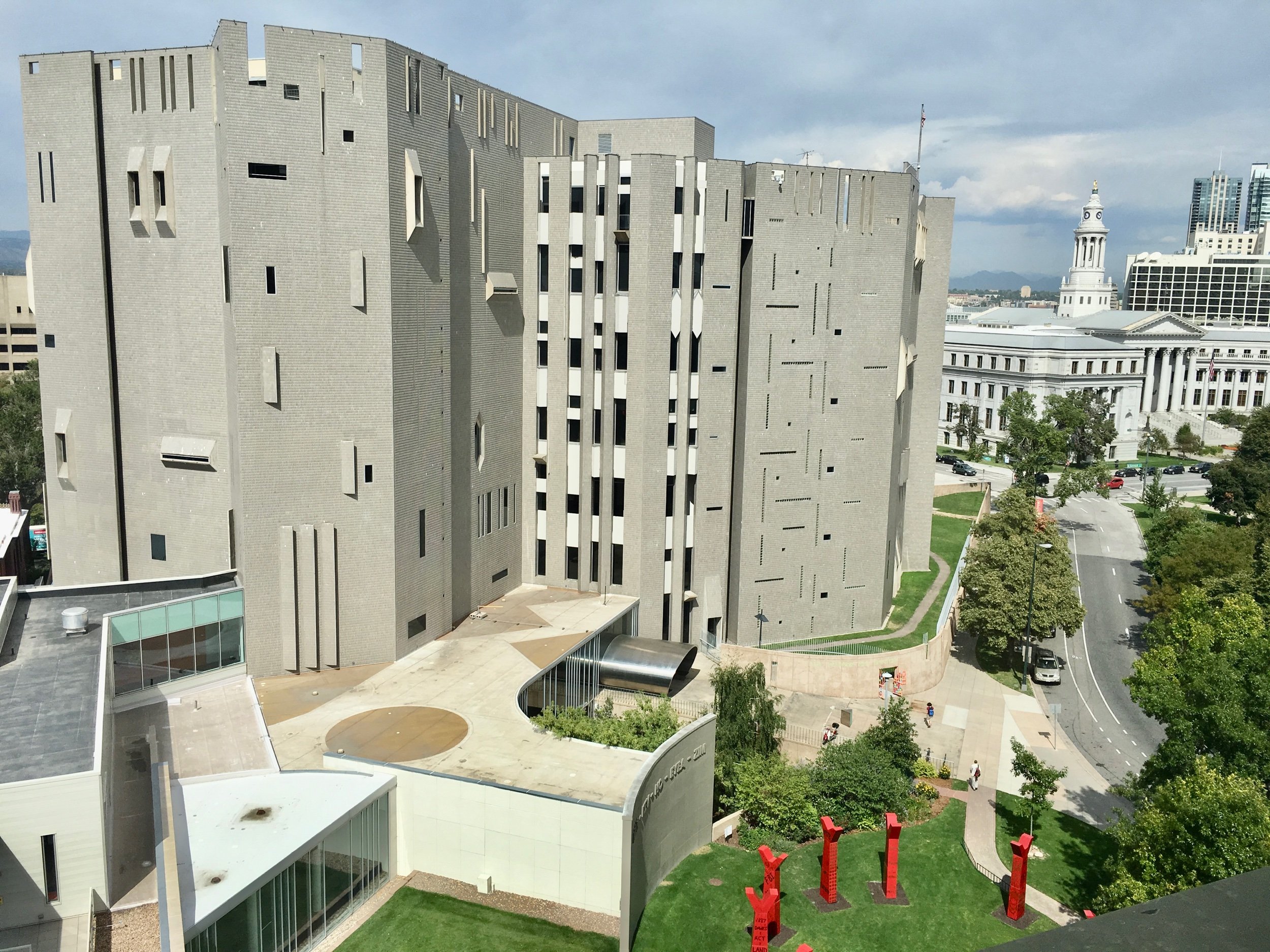
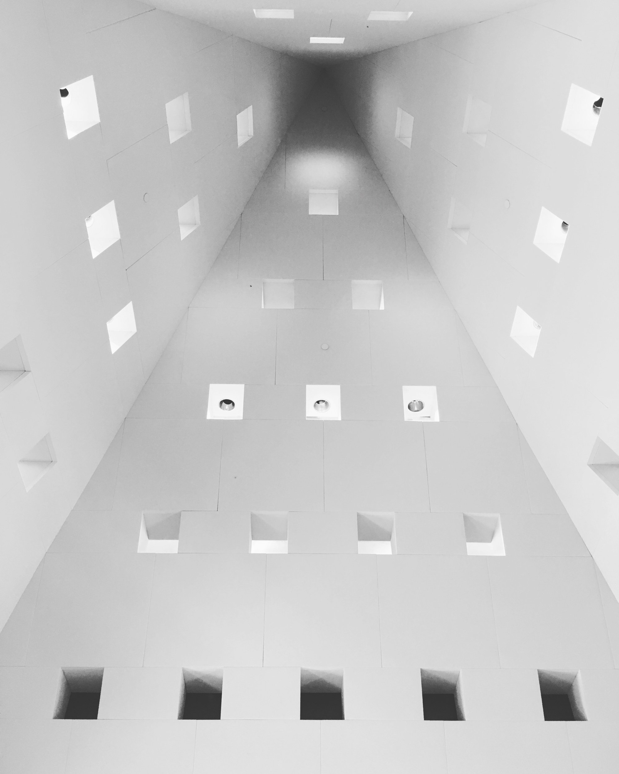
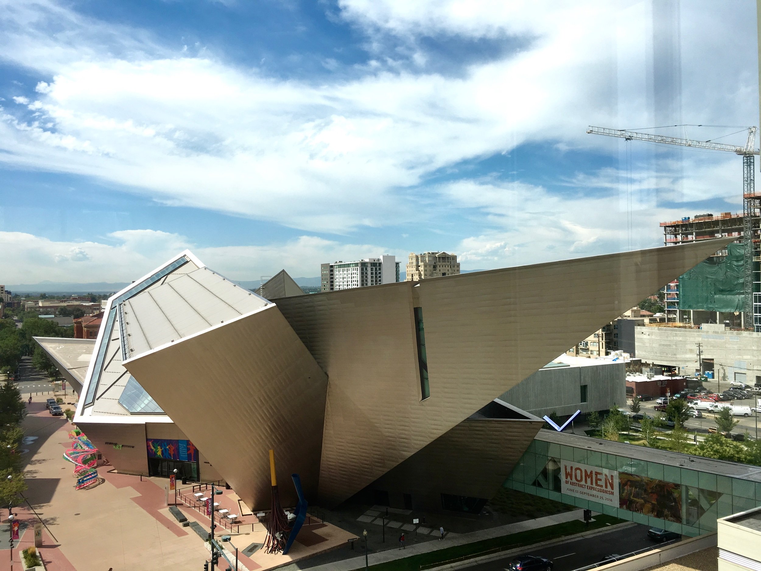
The view from the Library Commission Room on level 7 is spectacular whether looking towards Civic Center Park, towards the museums, or up towards the pyramidal ceiling.
To end this post - an image of the library at night.


