A Trio of Architecture Moments
There are the architecture fieldtrips to different cities and neighborhoods that require a bit of pre-planning and then there are the serendipitous spur-of-the-moment ones. Here are 3 of the latest architecture moments.
Caltech
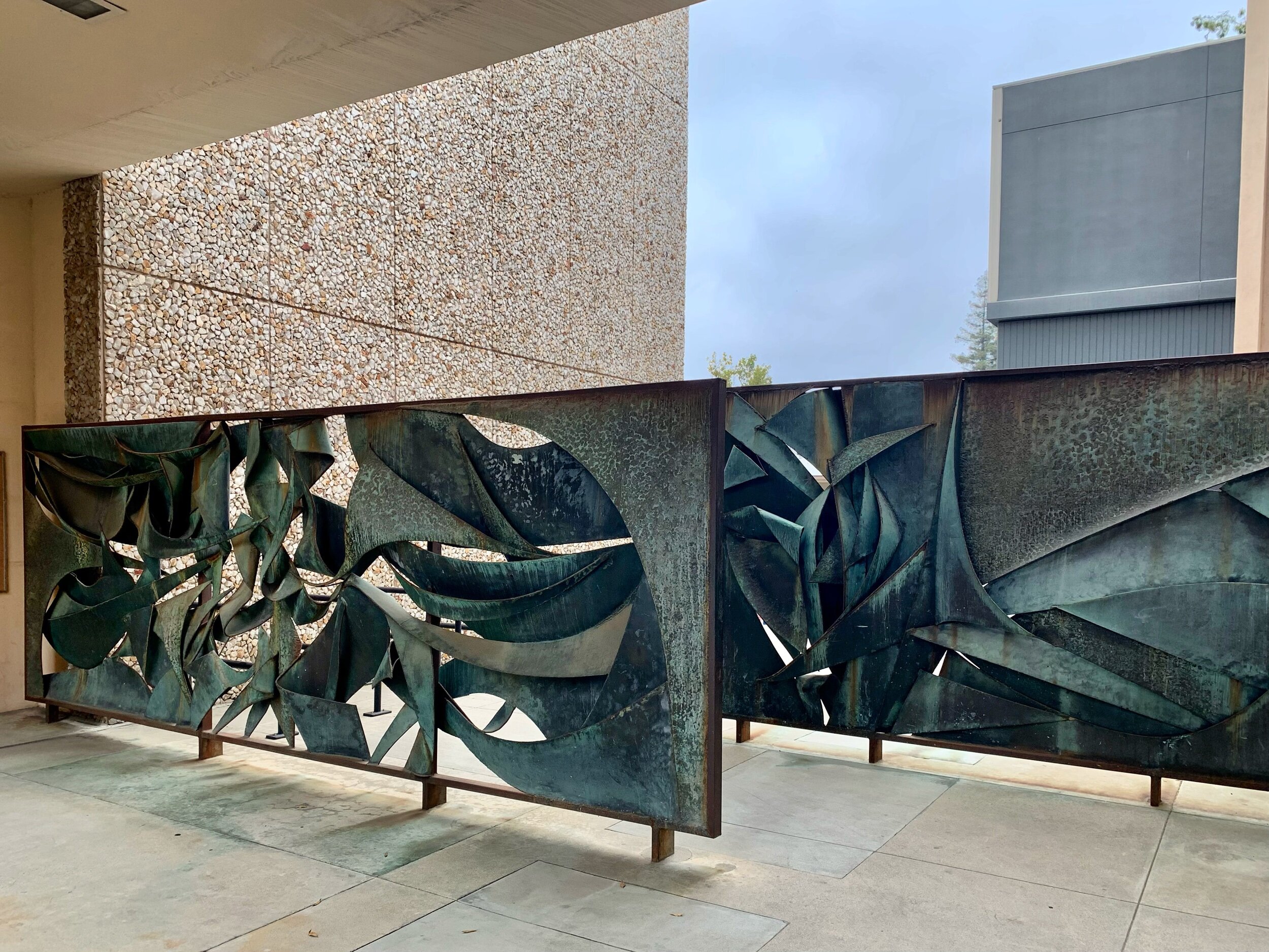
Above, two modernist moments captured on a mid-week run through the campus of Caltech. The bronze sculpture screen was a treat to find. I had read about and viewed public artwork on campus before. However, for this piece located outside the entrance of the Harry G. Steele Laboratory of Electrical Sciences, the only description I’ve found is the location and that it’s bronze. Out of the artwork on campus, it’s the one I enjoy most!
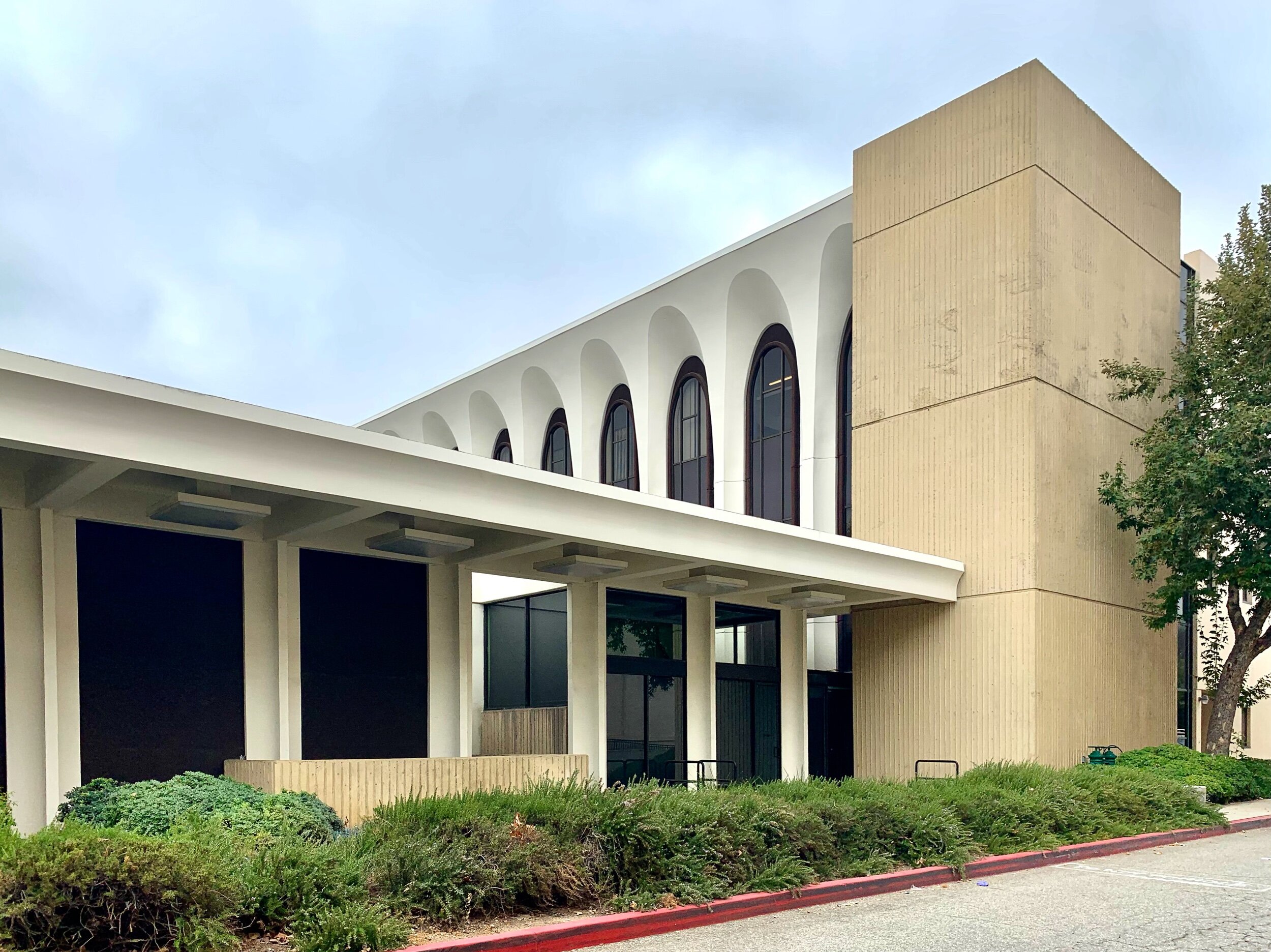
Though the view of the Arthur Amos Noyes Laboratory of Chemical Physics is from the back as opposed to the main entrance, the mid-century architecture presents nicely however you view it. The building,completed in 1967, was designed by Risley, Gould & Van Hueklyn.
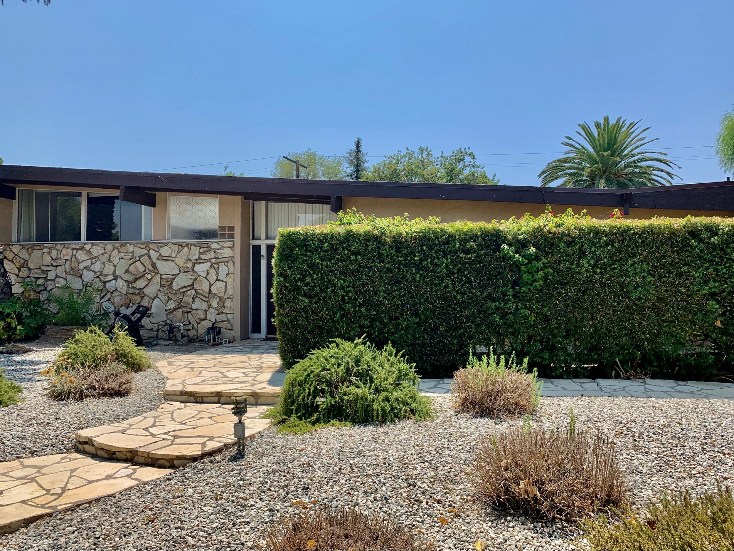
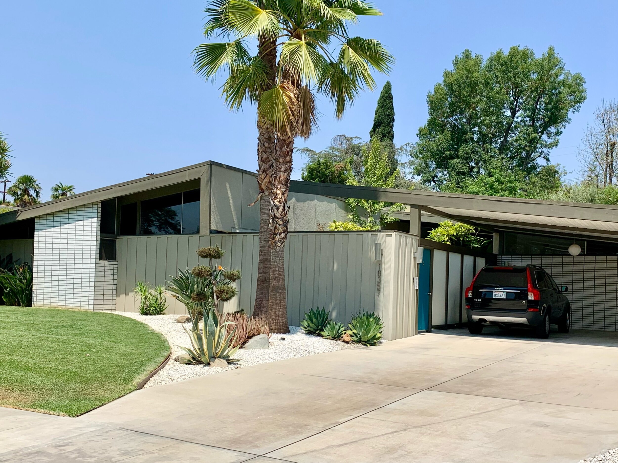
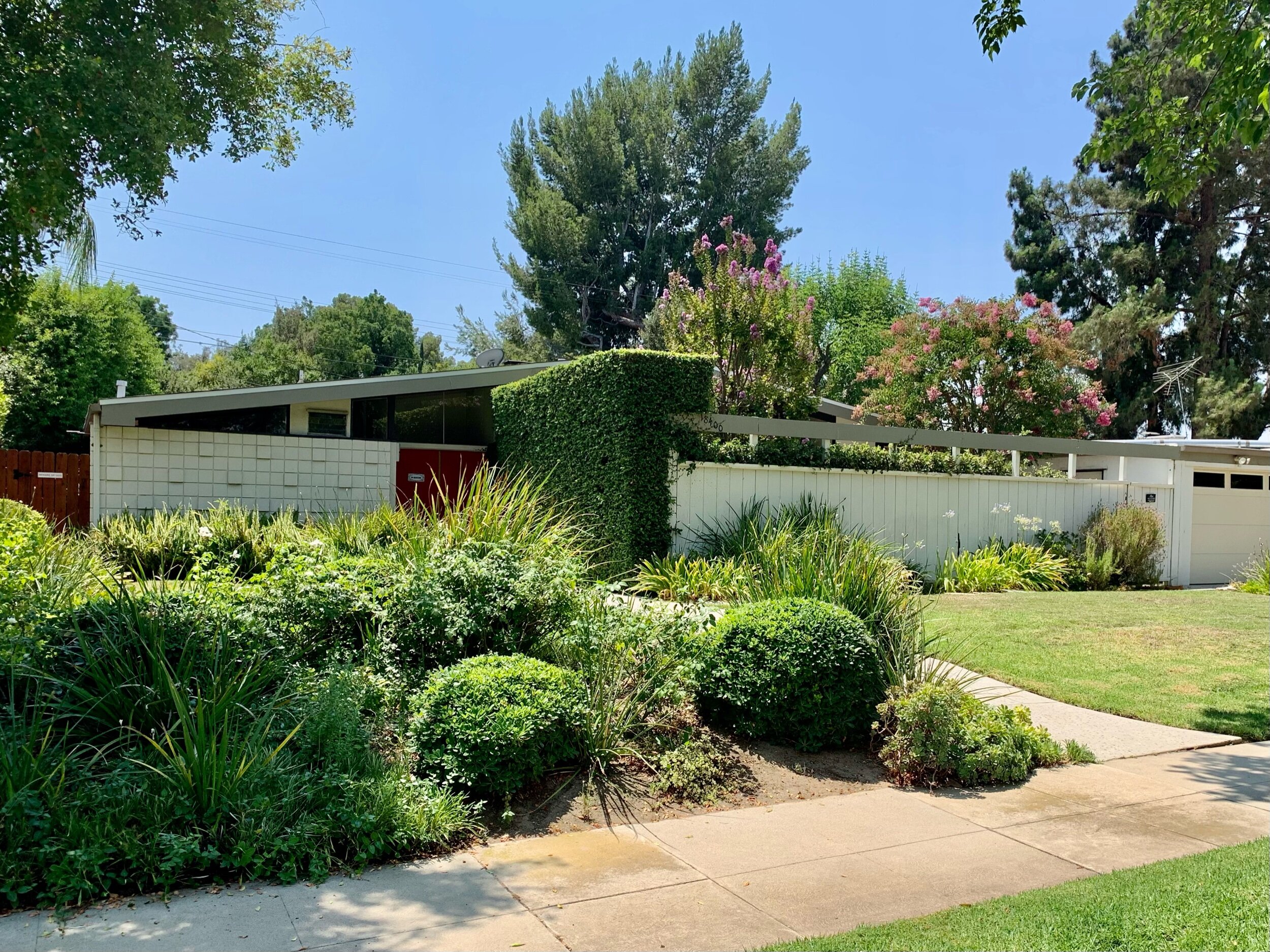
Mid-Century Palmer and Krisel Residential Tract in San Fernando Valley
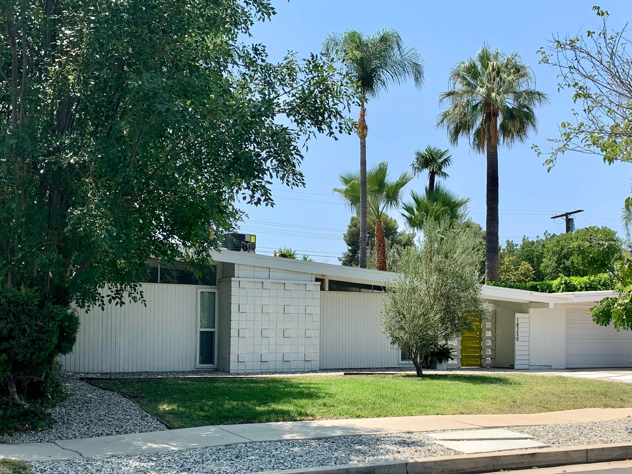
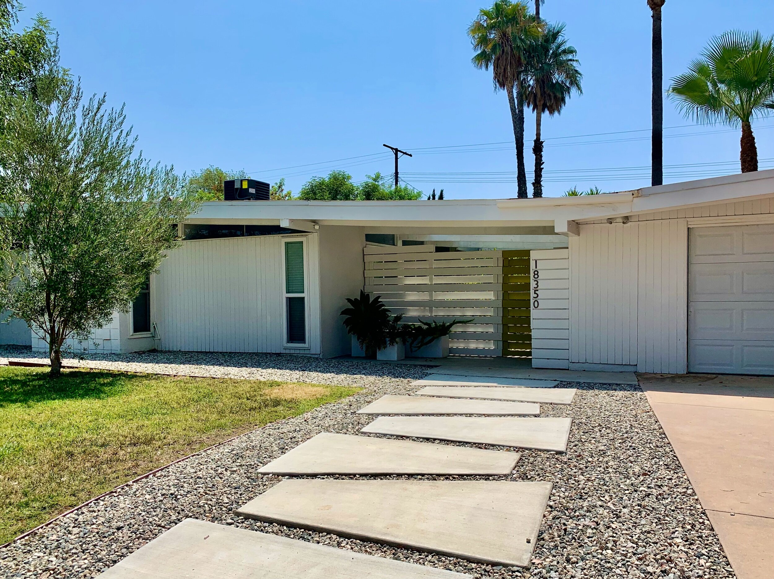
Our visit last month to this tract of mid-century homes designed by Dan Palmer and William Krisel was an add-on after a lunch outing to Brent’s Deli in Northridge. Upon deciding to drive to the deli for lunch, I did a quick google search for “mid century Northridge” in the area. A couple items down were two articles pertaining to ‘Living Conditioned Homes’ of Northridge.
The neighborhood is a fantastic collection of Palmer & Krisel's visually stunning Contemporary Ranch designs featuring low-pitched roofs, dramatic entrances, overhanging eaves, and cladding including concrete block, board and batten, bead board, stucco, and natural stone.
Click this LINK for a detailed write-up on the LA Conservancy website.
Union 76 Gas Station
Finally a great futuristic building to end on - the Union 76 Gas Station designed by architect Gin Wong of Pereira and Associates, completed in 1965. There’s a detailed write-up of the design on the LA Conservancy website (of course!), see LINK HERE. I learned the design was meant for a very different location, as part of Los Angeles International Airport (LAX) to complement the famous Theme Building.
The location didn’t work out in the airport’s plan and the amazing building ended up in Beverly Hills. I was aware of the gas station but had not made a special trip to visit it. By chance, I passed by on my way to the Frederick Weisman Foundation. I made a mental note to return to take a photo after my musuem visit which I happily did.


